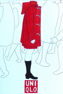
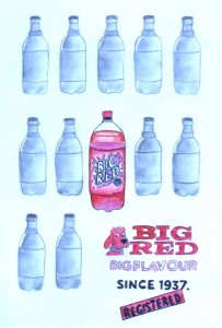
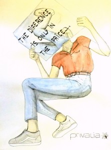
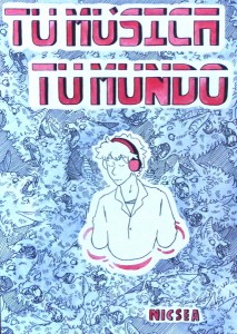
El segon treball teòric del curs de Disseny (Batxillerat d’Arts) planteja un doble repte:
- Desenvolupar els recursos relacionats amb la lectura i la organització d’imatges.
- Crear ciutadans crítics que puguin valorar com la publicitat ens intenta vendre un determinat producte mitjançant una sèrie de missatges connotats.
- Tipologia d’anunci.
- Característiques tècniques i gràfiques de l’anunci final.
- Discurs connotatiu utilitzat.
ADVERTISING PRACTICE: HAMILTON, A BROADWAY MUSICAL
ADVERTISED PRODUCT:
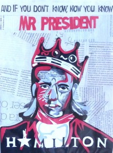
The product I chose to promote was the Broadway Musical “Hamilton”, which tells the story of the founding father Alexander Hamilton. One of the big innovations this show provided to its genre is its musical style: it incorporates hip-hop, rap, pop and soul, as well as traditional-style show tunes.
This musical has gained huge popularity over the course of the years since it premiered in February 2015 and has a very committed fan-base. By now, it has achieved cult status. That allows the production of the show to rise its prices and still completely sell out. The majority of the public that pays the 350$ tickets, already has listened to the musical songs and considers themselves a fan.
The ad I’m making is meant to be shown in bus and metro stations, similar to how it’s done with movie posters.
DENOTATION
The advert consists on a collage photography edit that directly references Notorious BIG’s “The final Chapter” album cover art, as well as a famous photo of the artist wearing a crown. It keeps its main structure but changes some elements to be references to the show. The face of the rap artist is replaced by Lin Manuel Miranda’s, the main actor and maker of the musical. The newspapers on the back are from Hamilton’s era, and the lyrics on his face are fragments of “The Reynolds Pamphlet”.
The size format is adapted from square to rectangle to fit as a poster. The sentence “And if you don’t know, now you know, Mr. President” is written at the top with the font of the original album cover, all in black except the last two words in red. The official Hamilton musical logo is at the bottom, in both black and white to contrast with background.
CONNOTATION
The intention of this ad is to resonate with those who already consider themselves fans of the show: it’s completely self-referential with its own iconography. Since tickets are a really limited and expensive resource, it doesn’t need to get through the masses and can be selective with its public. A way to appeal to this part of the fans is to give them hidden references that only “true fans” may understand.
The link created between the figure of Alexander Hamilton and Notorious BIG is held by multiple similarities between both figures. The most obvious connection is the style of music the show and the singer share. There’s also an explicit reference to him on the lyrics of the show, quoted here on the top part of the poster (“If you don’t know, now you know” is a famous line from BIG’s song “Juicy”, and appears several times throughout the musical). There are also similarities on both of their lives: They grew up poor and rose quickly to fame and success, were both shot to death while still young, and the iconography of the tilted crown as symbol of power suits Hamilton’s life.
TECHNICAL AND GRAPHIC CHARACTERISTICS OF THE FINAL PRODUCT
The result of this would be a digital photography edit that includes multiple textures being added to a picture of Miranda’s face as well as some painting done over it. It must look as much as the original as possible while adding the new show related elements. It’s also really important to keep the contrast high so it has the same visual impact than as disc cover.
ADVERTISING PRACTICE: TOHATO CHOCOBI COOKIES
ANNOUNCED PRODUCT
The product I’ve chosen are the Tohato Chocobi cookies from Crayon Shin-Chan, a Japanese animated series. These cookies were originally shown in the series, and seeing as the show made itself famous all the way outside Japan, Tohato decided to make the cookies that Shin-Chan loved so much into a real product.
Tohato is a famous snack brand in Japan which has introduced some of Japan’s most culturally iconic snacks to the masses. They use famous Japanese pop-culture characters, such as Shin-Chan in this case for the Tohato Chocobi cookies. This is one of their most popular products. They’re star-shaped snacks, corn-based and crunchy with a mild chocolate flavor that comes in a hexagonal-shaped box. Like their other products, the box has a cute and quirky design with very bright colors (typical among snack products in Japan) and the iconic purple dinosaur which you can see in Crayon Shin-Chan. Each box also includes a little pack of character stickers and is sold for 25.639’74¥ in Japan, which equals 1’98€. All of these facts set the target customers, ranging from children who might watch the show or just like the taste, to teenagers, and to adults who might either want it for themselves or for their children.
The advertisement for this product would be an A2 size poster located at the windows of Japanese food stores since that’s where people who might be interested in the product would go.
DENOTATION
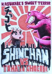
The poster would be a traditional illustration on a yellow-toned paper to make it look like an old movie poster. At the top, you would see the slogan “Kasukabe’s sweet terror” and at the bottom, with larger font on top of a black silhouette of a city’s many buildings and dripping paint, you would read “ShinChan”. Below that, “VS. Tohato Chocobi”. Between these two spaces (the top sentence and the ones at the bottom), you would see Shin-Chan and the cookie dinosaur facing each other from the side, with Japan’s rising Sun at the back. The characters would be cut off by the legs. The Tohato brand’s logo would be at the left below the top slogan in Japanese characters.
DISCOURSE USED (CONNOTATIONS)
This advertisement is made for the mature and nostalgic fan base of the Crayon Shin-Chan series: it began airing on 1992, but its source material (Manga) began publishing on 1990, and it started off as a comedy gag Manga made for the mature demographic. Therefore, the real fans of this series will be the ones who are now in their early to late 30s, who at the time would have been in their early 20s or so. A lot of these fans are now nostalgic, wishing the series would once again be what it used to be; comedy made strictly for adults.
Because of this, the poster itself is a reference to the poster for the Godzilla movie, Godzilla VS Mothra and Ghidorah, released in 2001 in Japan. The dinosaur in Shin-Chan’s cookies is very heavily based on Godzilla, which was a blast around the time the series was airing (during the late 80s-90s). Because of this, real fans of the show who have been there since day 1 would also remember Godzilla, which isn’t only the inspiration for this creature but was also a box office success in Japan by the time they were first reading the Manga. This is why the poster has an old, grungy feeling, just like this movie’s poster: it’s supposed to take you back to that time and feel immersed as you remember how the series used to be back then, as well as feel like Shin-Chan himself, facing off against the biscuit dinosaur.
TECHNICAL AND GRAPHIC CHARACTERISTICS OF THE FINAL PRODUCT
The final result would be a traditional illustration copying the referenced poster’s style as much as possible. The paper would also have to be yellow-toned and, once the illustration was done, you would spray some small dots of white and black ink over some spots at the paper to make the old and worn look more accurate. It would be done with markers, ink, and spray, like in the original poster. It’s very relevant to keep the colors at the same tone and contrast so the worn look looks well together.


